Where is the safety gap?איפה פער הבטיחות?
How engineers see, find, define and count the moments that show whether a self-driving system is safe.איך מהנדסים רואים, מוצאים, מגדירים וסופרים את הרגעים שמראים אם מערכת נהיגה אוטונומית בטוחה.
Overview
A simulation produces numbers. Engineers need events.
A self-driving programme runs hundreds of thousands of simulations to argue that its vehicle is safe enough for public roads. A verification engineer has to know what happened in them: did a car cut in, did the vehicle brake, and how often across the whole regression.
That is step four of Foretellix's flow, Check and measure. Product defined the interval: a named event with a start and an end, recorded during the simulation. I designed how people see intervals, find them, define their own and count them toward coverage.
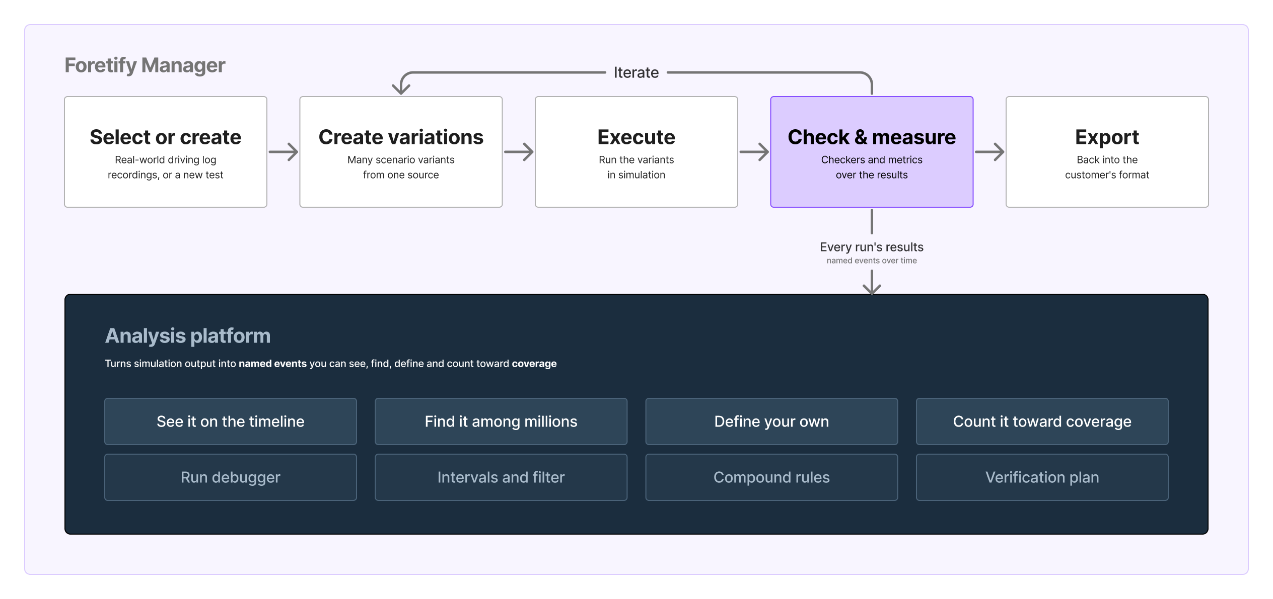
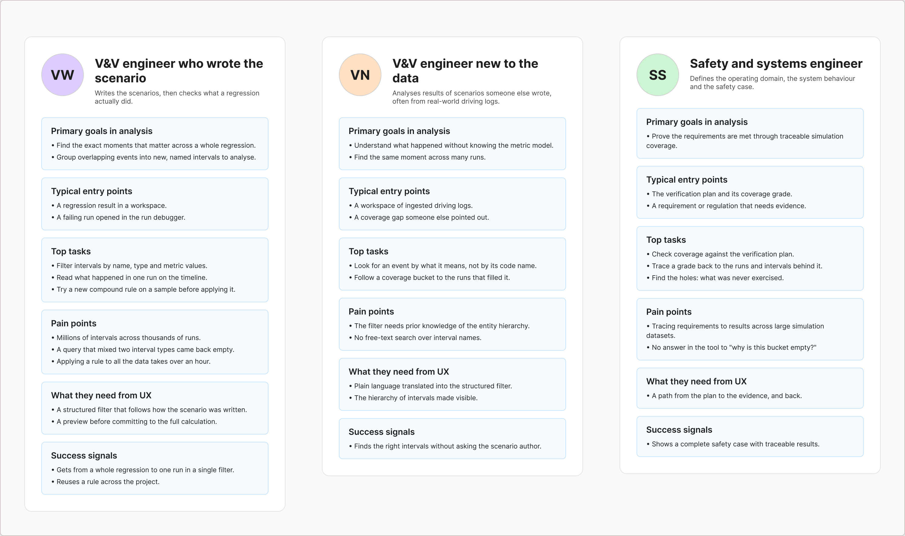
My role. From 2023 to 2026, as Senior UX Designer and then UX Lead, I owned the interaction model for intervals: the timeline, the filter, the editor for new ones and the path back from coverage. The concepts were product's. I shaped the data model with product and engineering, and directed a designer on my team.
Four design decisions shaped the answer to the title's question.
The problem
Reading a line to guess an event
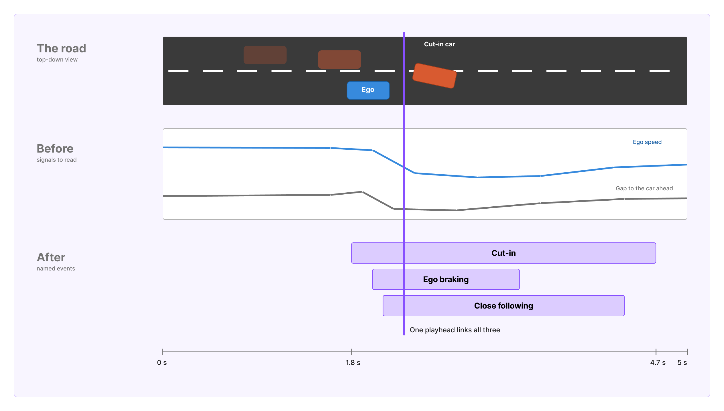
Before intervals, a run's results were values plotted over time: speed, distance, acceleration. To know a cut-in happened, an engineer inferred it from the lines, like reading a heart-rate chart to guess when someone started running. An interval says it outright: cut-in, 1.8 to 4.7 seconds.
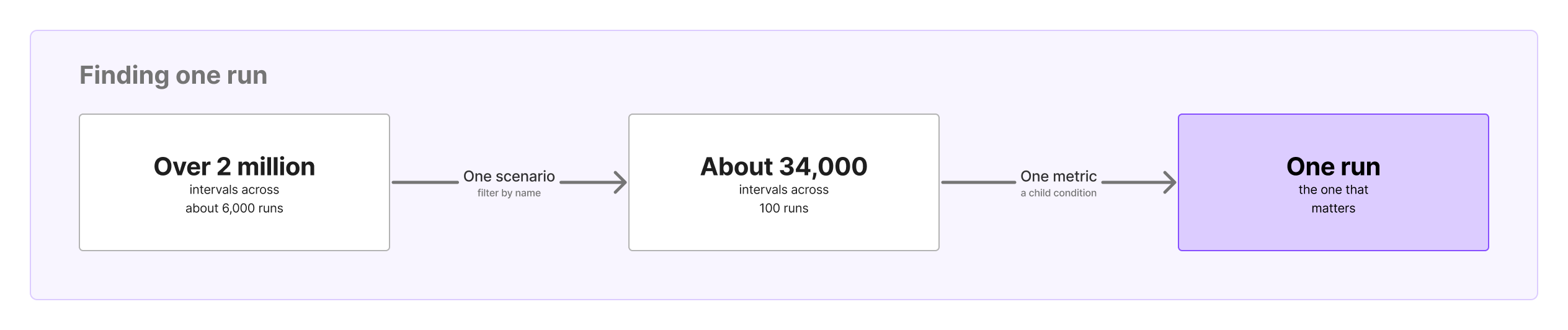
That works for one run. One workspace held over two million intervals, and the system was built for hundreds of millions. A query mixing two kinds of interval came back empty.
Background
Events you plan before the run
An interval exists only if someone planned for it. The engineer writes into the scenario's code what to look for: checkers, and scenario matching that recognises a manoeuvre such as a cut-in.
These usually come from the verification plan, the list of situations the programme must cover and measure. Foretify computes them during the run, and every value they carry is counted against that plan.
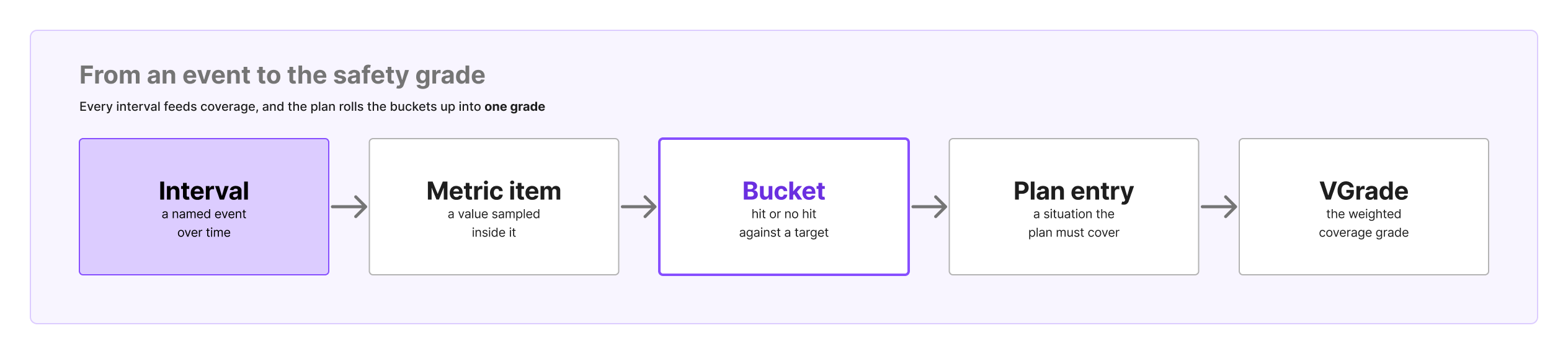
Under every coverage item in the plan sit its buckets, ranges of a value such as speed at the start of a cut-in, each hit or not against a target. The plan rolls them up into a grade, and the empty buckets are the safety gap.
Anything not planned in advance can't be found afterwards. So users later asked to define new events after the run, from data that already existed. That became compound intervals, in decision 3.
How I worked
The brief said draw it
My first brief was to visualise intervals. Drawing them served one run, already found. The real job was analysis across hundreds of thousands of runs, where people query, combine and count. So the work moved from making intervals visible to making them findable, definable and countable.
I started by mapping what an interval could be, with the product team's definitions on one board. Then I looked at tools that already show events over time: animation timelines in After Effects and Maya, Gantt views in project tools, the Visual Studio and Chrome debuggers, and transaction debug views from chip verification.
Interviews and quick usability sessions with application engineers, who worked with customers daily, stood in for the user access I didn't have.
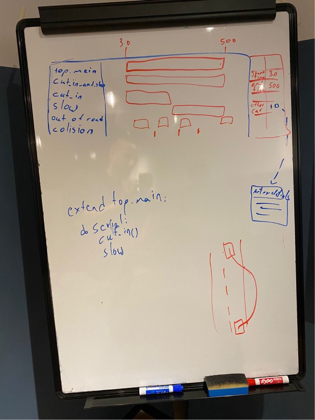
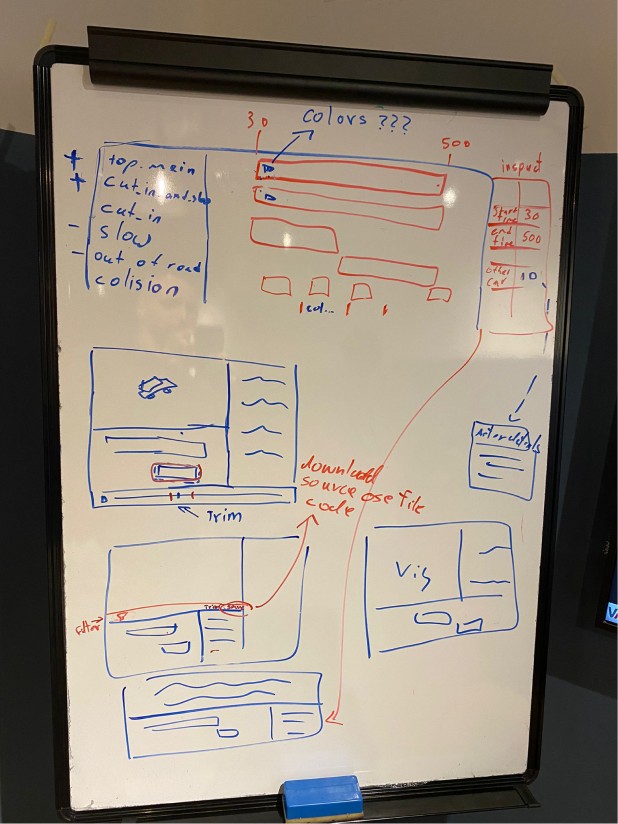
March 2023, first sketches: event rows over time, an inspector for the selected one, and the map on the same screen.
Design decision 1
One timeline, in step with the car
Once intervals existed, people had to see them, next to the car doing them.
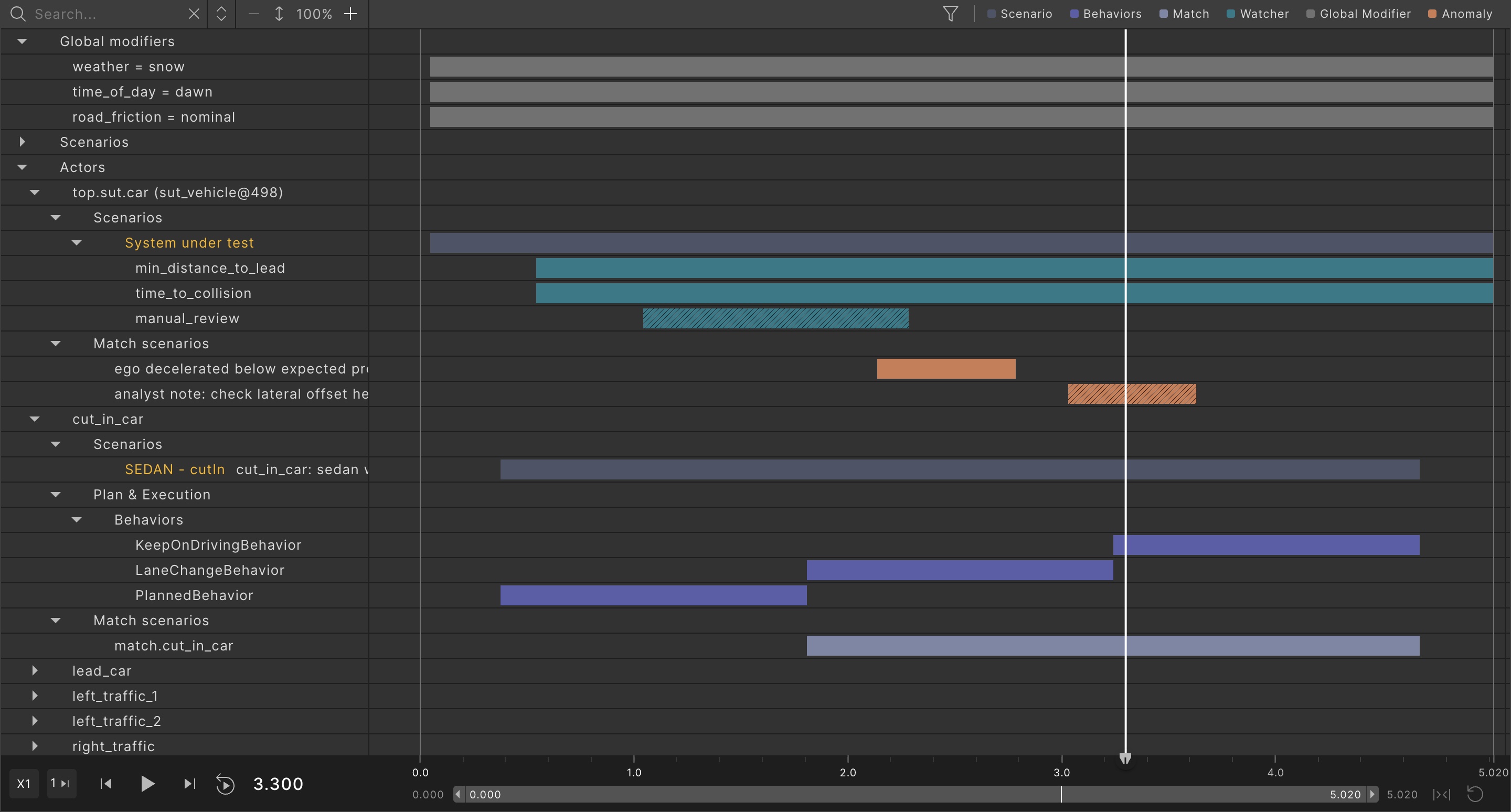
Show every interval as a row on one timeline, in a tree, with one cursor shared with the visualizer. Move the time and the map follows, so the manoeuvre and the event's duration are read together, as at the end of the video above.
My part was the layout: rows over time, the shared cursor and the tree. Two other designers worked on the first wireframes with me. Application engineers were split on mixing value traces with intervals, so the two started apart and joined a release later.
Every new kind of event then wanted its own look. I treated visual channels as a budget. Each type gets one look and a legend entry that filters it, and the only pattern, stripes, marks intervals users upload.
Design decision 2
Which event, then what happened inside it
Engineers' questions have two parts: which event, and what happened during it. For example, cut-ins where the speed during the cut-in was over 60.
The first interval filter couldn't ask that. It couldn't say which kind of interval to return, so a query mixing two kinds came back empty, and it couldn't reach the values measured inside an interval. Product led a revamp of all the app's filters to fix this, with a two-level filter at its core. Engineering capped it at two levels, for speed and for usability.
Set both levels in one form, in one go. That was product's ruling. The form that makes it possible was mine:
- One form, two levels: an interval, a condition on its own values beneath it, one click.
- A magic wand on any interval or metric you find: one click filters all the results by it, without opening the full filter.
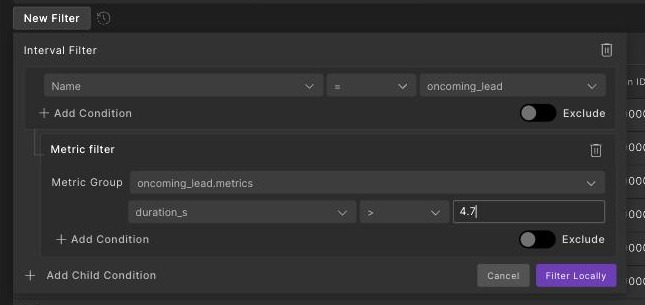
The design didn't break. Its assumption about the user expired. In 2023 the people analysing results had written the scenarios and knew the names. Real-world driving logs brought engineers who never had, and the strict filter asked too much of them. My AI aid for it, shipped in 2025, was the first answer.
Design decision 3
Pairs, then compose
Planned events answered the questions people knew to ask before the run. Coverage and validation engineers then had new ones after it: a cut-in during a junction approach, say, built from intervals that already existed. Product's answer was compound intervals, and a customer asked for up to five intervals in one rule.
Allow two intervals per rule, joined by a time relation such as A starts before B. A compound is itself an interval, so nesting compounds inside compounds builds any combination, pair by pair. I pushed back hard on five, and two shipped.
My research showed two were enough, because nesting covers the rest. And I was wary of ambiguity. A time relation is always between two intervals. With three in one rule, the form must say which pair each relation joins, and with four, six pairs.
Supporting five from day one meant a far heavier UX and backend for a need nobody had tested. Better to start lean and see whether users could work with two.
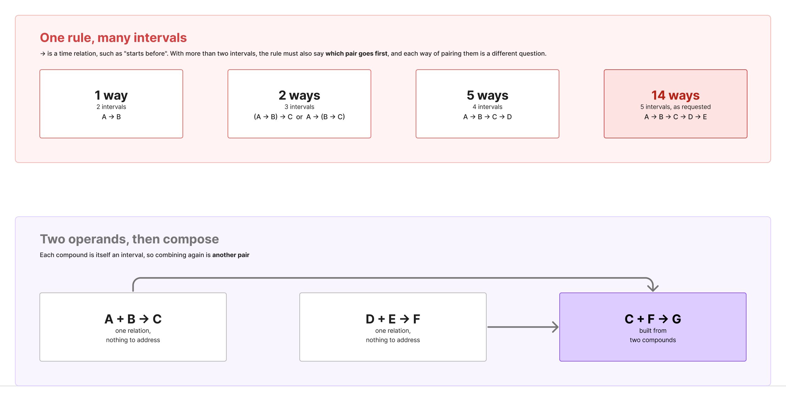
Applying a rule to all the data took over an hour, so the tech lead and I designed a playground: the first matches on real data in about a minute, before saving.
I also said early that compounds would need a rules manager. It came later, with my column wording.
Design decision 4
A bucket hands back what filled it
The plan showed where the gap was, but a bucket was only a number. Nothing connected it to the runs and the moments behind it.
Make every bucket a way back to its evidence: its runs appear beneath it, or an interval filter opens its events. The intervals route was my idea. I also proposed showing the histogram inside the plan rather than in a separate app, and a designer on my team built it under my direction.
The precise answer costs you your place: the interval route leaves the plan. And nobody, me included, designed for the opposite question: why is this bucket empty?
Process
From Figma to a code branch
Most of this work was designed in Figma and handed over in Zeplin, with the filter's keyboard model written as a specification. When a delivery review found designs changing after planning, its two fixes were mine: a review with developers after each upload, and a mark for when a design is final.
By 2026 I designed in a code branch, with AI tools, on the shared components in Storybook. Moving compound rules to the project, shared by every workspace, reached engineering as a working branch, and developers kept testing and stability.
Outcome
Where is the safety gap? The plan now shows it
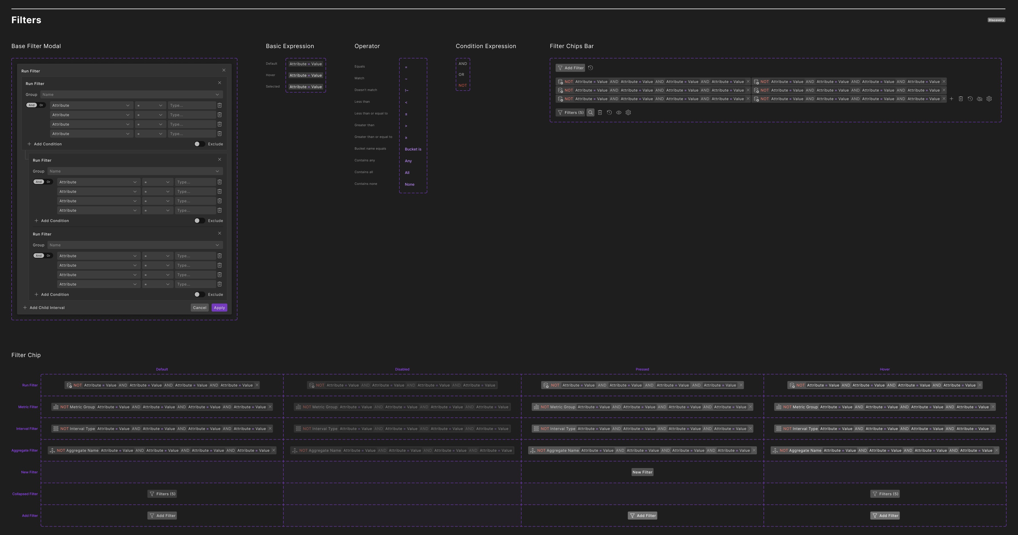
The model shipped in steps from 2023 to 2026: intervals on the timeline, the two-level filter, compound intervals with the playground, buckets that open their evidence, and rules shared across the project.
Finding a moment, before and after
- Before: Open one run at a time, read the lines, and hope the right run is in front of you.
- After: Filter by the event and a value inside it, define your own and preview it in a minute, then follow a bucket back to what filled it.
How widely it was used, I can't say: one month on two internal servers shows the debugger drew about five times the views of the interval pages, which fits the reframe. Measuring it was partly my job: my ticket to define analytics events stayed open.
What I would do differently
Skip the separate rule editor. Users already found things in the debugger and the filtered table. A blank form asks them to describe what they were looking at. Better: select what you found and name it, because naming it makes it a rule. I proposed this early, and a principal engineer argued the same.
סקירה
סימולציה מייצרת מספרים. מהנדסים צריכים אירועים.
תוכנית לרכב אוטונומי מריצה מאות אלפי סימולציות כדי להראות שהרכב שלה בטוח מספיק לכביש. מהנדס האימות צריך לדעת מה קרה בהן: האם רכב נכנס לנתיב, האם הרכב הנבדק בלם, וכמה פעמים זה קרה בכל ה-regression.
זה השלב הרביעי בתהליך של Foretellix, Check and measure. צוות המוצר הגדיר את ה-interval: אירוע עם שם, התחלה וסוף, שנרשם בזמן הסימולציה. אני עיצבתי איך רואים intervals, איך מוצאים אותם, איך מגדירים חדשים ואיך הם נספרים לכיסוי.
התפקיד שלי. בין 2023 ל-2026, כ-Senior UX Designer ואחר כך כ-UX Lead, הייתי אחראי על מודל האינטראקציה של ה-intervals: ציר הזמן, הסינון, העורך להגדרת חדשים והדרך חזרה מהכיסוי. הקונספטים היו של צוות המוצר. עיצבתי איתם ועם הפיתוח את מודל הנתונים, והנחיתי מעצבת מהצוות שלי.
ארבע החלטות עיצוב עיצבו את התשובה לשאלה שבכותרת.
הבעיה
לקרוא קו כדי לנחש אירוע
לפני ה-intervals, התוצאות של הרצה היו ערכים על ציר זמן: מהירות, מרחק, תאוצה. כדי לדעת שרכב נכנס לנתיב, המהנדס הסיק את זה מהקווים, כמו לקרוא גרף דופק ולנחש מתי מישהו התחיל לרוץ. interval אומר את זה במפורש: cut-in, משנייה 1.8 עד 4.7.
זה עובד להרצה אחת. workspace אחד הכיל יותר משני מיליון intervals, והמערכת נבנתה למאות מיליונים. שאילתה שערבבה שני סוגי intervals החזירה תוצאה ריקה.
רקע
אירועים שמתכננים לפני ההרצה
interval קיים רק אם מישהו תכנן אותו. המהנדס כותב בקוד של התרחיש מה לחפש: checkers, ו-scenario matching שמזהה תמרון כמו כניסה לנתיב.
בדרך כלל הם נגזרים מתכנית האימות, רשימת המצבים שהתוכנית חייבת לכסות ולמדוד. Foretify מחשב אותם בזמן ההרצה, וכל ערך שהם נושאים נספר מול התכנית הזאת.
מתחת לכל פריט כיסוי בתכנית יש buckets, טווחים של ערך כמו מהירות בתחילת כניסה לנתיב, וכל אחד נפגע או לא מול יעד. התכנית מסכמת אותם לציון, וה-buckets הריקים הם פער הבטיחות.
מה שלא תוכנן מראש אי אפשר למצוא אחר כך. לכן משתמשים ביקשו בהמשך להגדיר אירועים חדשים אחרי ההרצה, מנתונים שכבר קיימים. זה הפך ל-compound intervals, בהחלטה 3.
איך עבדתי
הבריף אמר לצייר
הבריף הראשון היה להציג intervals בצורה ויזואלית. הציור שירת הרצה אחת שכבר נמצאה. העבודה האמיתית הייתה ניתוח של מאות אלפי הרצות, שבו שואלים, משלבים וסופרים. אז העבודה עברה מלהפוך intervals לגלויים, ללאפשר למצוא, להגדיר ולספור אותם.
התחלתי במיפוי של מה interval יכול להיות, עם ההגדרות של צוות המוצר על לוח אחד. אחר כך בדקתי כלים שכבר מציגים אירועים לאורך זמן: צירי זמן של אנימציה ב-After Effects וב-Maya, תצוגות Gantt בכלי ניהול פרויקטים, הדיבאגרים של Visual Studio ושל Chrome, ותצוגות דיבאג של טרנזקציות מעולם אימות השבבים.
ראיונות ובדיקות שימושיות קצרות עם מהנדסי האפליקציה, שעבדו עם הלקוחות כל יום, היו התחליף לגישה למשתמשים שלא הייתה לי.
מרץ 2023, סקיצות ראשונות: שורות של אירועים לאורך זמן, inspector לאירוע שנבחר, והמפה על אותו מסך.
החלטת עיצוב 1
ציר זמן אחד, בקצב של הרכב
ברגע שה-intervals היו קיימים, היה צריך לראות אותם, ליד הרכב שעושה אותם.
להציג כל interval כשורה על ציר זמן אחד, בתוך עץ, עם סמן זמן אחד משותף עם ה-visualizer. מזיזים את הזמן והמפה זזה איתו, כך שקוראים את התמרון ואת משך האירוע יחד, כמו בסוף הסרטון למעלה.
החלק שלי היה הפריסה: שורות לאורך זמן, הסמן המשותף והעץ. שני מעצבים נוספים עבדו איתי על הסקיצות הראשונות. מהנדסי האפליקציה היו חלוקים לגבי שילוב של אותות ערכים עם intervals, אז השניים התחילו בנפרד והתאחדו גרסה אחר כך.
כל סוג אירוע חדש רצה אחר כך מראה משלו. התייחסתי לערוצים חזותיים כאל תקציב. לכל סוג מראה אחד ופריט במקרא שמסנן אותו, והדוגמה היחידה, פסים, מסמנת intervals שמשתמשים מעלים.
החלטת עיצוב 2
איזה אירוע, ומה קרה בתוכו
לשאלות של מהנדסים יש שני חלקים: איזה אירוע, ומה קרה בזמן שלו. למשל, כניסות לנתיב שבהן המהירות בזמן הכניסה הייתה מעל 60.
הסינון הראשון של ה-intervals לא ידע לשאול את זה. הוא לא ידע להגדיר איזה סוג interval להחזיר, אז שאילתה שמשלבת שני סוגים חזרה ריקה, והוא לא הגיע לערכים שנמדדו בתוך interval. צוות המוצר הוביל חידוש של כל הסינונים באפליקציה כדי לתקן את זה, ובמרכזו סינון בשתי רמות. הפיתוח הגביל אותו לשתי רמות, בגלל ביצועים ושימושיות.
להגדיר את שתי הרמות בטופס אחד, בבת אחת. זו הייתה קביעה של צוות המוצר. הטופס שמאפשר את זה היה שלי:
- טופס אחד, שתי רמות: interval, ומתחתיו תנאי על הערכים שלו, בלחיצה אחת.
- שרביט קסם על כל interval או מדד שמצאת: לחיצה אחת מסננת לפיו את כל התוצאות, בלי לפתוח את הסינון המלא.
העיצוב לא נשבר. ההנחה שלו לגבי המשתמש פגה. ב-2023 מי שניתח תוצאות גם כתב את התרחישים והכיר את השמות. נתוני נהיגה מהעולם האמיתי הביאו מהנדסים שמעולם לא כתבו תרחיש, והסינון המדויק דרש מהם יותר מדי. עוזר ה-AI שעיצבתי לו, שיצא ב-2025, היה התשובה הראשונה.
החלטת עיצוב 3
זוגות, ואז הרכבה
אירועים מתוכננים ענו על השאלות שידעו לשאול לפני ההרצה. מהנדסי כיסוי ואימות שאלו אחריה שאלות חדשות: למשל כניסה לנתיב בזמן התקרבות לצומת, שבנויה מ-intervals שכבר קיימים. התשובה של צוות המוצר הייתה compound intervals, ולקוח ביקש עד חמישה intervals בכלל אחד.
לאפשר שני intervals בכל כלל, שמחובר ביניהם יחס זמן כמו A starts before B. כל compound הוא בעצמו interval, ולכן קינון של compounds זה בתוך זה בונה כל צירוף, זוג אחרי זוג. התנגדתי בתוקף לחמישה, ושניים הם מה שיצא.
המחקר שלי הראה ששניים מספיקים, כי הקינון מכסה את השאר. וחששתי מעמימות. יחס זמן הוא תמיד בין שני intervals. עם שלושה בכלל אחד, הטופס חייב לומר איזה זוג כל יחס מחבר, ועם ארבעה, שישה זוגות.
תמיכה בחמישה מהיום הראשון הייתה מובילה ל-UX ולתשתית כבדים בהרבה, בשביל צורך שאף אחד עוד לא בדק. עדיף להתחיל רזה ולראות אם משתמשים מסתדרים עם שניים.
הפעלת כלל על כל הנתונים לקחה יותר משעה, אז ה-tech lead ואני עיצבנו playground: ההתאמות הראשונות על נתונים אמיתיים תוך כדקה, לפני השמירה.
אמרתי גם מוקדם שה-compounds יצטרכו מנהל כללים. הוא הגיע מאוחר יותר, עם הניסוח שלי לעמודות.
החלטת עיצוב 4
bucket שמחזיר את מה שמילא אותו
התכנית הראתה איפה הפער, אבל bucket היה רק מספר. שום דבר לא חיבר אותו להרצות ולרגעים שמאחוריו.
להפוך כל bucket לדרך חזרה לראיות שלו: ההרצות שלו מופיעות מתחתיו, או סינון intervals פותח את האירועים שלו. הדרך דרך ה-intervals הייתה הרעיון שלי. הצעתי גם להציג את ההיסטוגרמה בתוך התכנית ולא באפליקציה נפרדת, ומעצבת מהצוות שלי בנתה אותה בהנחיה שלי.
התשובה המדויקת עולה לך במקום שלך: הדרך דרך ה-intervals יוצאת מהתכנית. ואף אחד, כולל אני, לא עיצב את השאלה ההפוכה: למה ה-bucket הזה ריק?
תהליך
מ-Figma לענף קוד
רוב העבודה הזאת עוצבה ב-Figma ונמסרה ב-Zeplin, ומודל המקלדת של הסינון נכתב כמפרט. כשסקירת מסירה מצאה שעיצובים משתנים אחרי התכנון, שני התיקונים הוטלו עליי: סקירה עם המפתחים אחרי כל העלאה, וסימון ברור מתי עיצוב סופי.
ב-2026 כבר עיצבתי בענף קוד, עם כלי AI, על הרכיבים המשותפים ב-Storybook. העברת כללי ה-compound לרמת הפרויקט, משותפים לכל ה-workspaces, הגיעה לפיתוח כענף עובד, והבדיקות והיציבות נשארו אצל המפתחים.
התוצאה
איפה פער הבטיחות? עכשיו התכנית מראה אותו
המודל יצא בשלבים בין 2023 ל-2026: intervals על ציר הזמן, הסינון בשתי רמות, intervals מסוג compound עם ה-playground, buckets שפותחים את הראיות שלהם, וכללים משותפים לכל הפרויקט.
למצוא רגע, לפני ואחרי
- לפני: לפתוח הרצה אחת בכל פעם, לקרוא את הקווים, ולקוות שההרצה הנכונה מולך.
- אחרי: לסנן לפי האירוע וערך שבתוכו, להגדיר אירוע משלך ולראות אותו תוך דקה, ואז לחזור מ-bucket אל מה שמילא אותו.
כמה השתמשו בזה, אני לא יכול לומר: חודש אחד על שני שרתים פנימיים מראה שה-debugger קיבל בערך פי חמישה צפיות מעמודי ה-intervals, וזה מתיישב עם המסקנה. המדידה הייתה בחלקה התפקיד שלי: המשימה שלי להגדיר אירועי analytics נשארה פתוחה.
מה הייתי עושה אחרת
לוותר על עורך כללים נפרד. משתמשים כבר מצאו דברים ב-debugger ובטבלה המסוננת. טופס ריק מבקש מהם לתאר את מה שהם כבר הסתכלו עליו. עדיף: לבחור את מה שמצאת ולתת לו שם, כי השם הוא מה שהופך אותו לכלל. הצעתי את זה מוקדם, ומהנדס בכיר טען אותו דבר.