
Wix Platform
Applicationאפליקציות
בפלטפורמת Wix
Wix Application Platform Builderכלי בניית האפליקציות של Wix
Project Goal
A Universal Editing Experience for Wix Applications
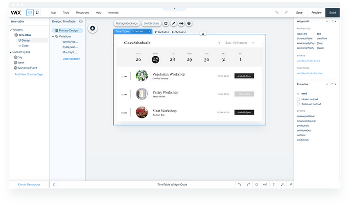
Wix developed a platform for building web applications across its editors, based on Wix components and infrastructure. The design challenge: create an editing experience that lets any Wix user customise an application — regardless of their technical skill — without breaking the application builder's ability to push updates.
Key Outcomes
What the Project Delivered
Research-driven scope
The 80-90% finding from user interviews directly defined which mode to prioritise. Rather than designing for the edge case, we built the Closed mode to serve the majority and preserved Open mode for loyal power users who grow into it.
Dual-audience design
The project required balancing two different types of "users" simultaneously - the application builder who creates the widget and the site owner who customises it. Every design decision had to work for both without breaking either.
Update-safe customisation
Solved a platform-level constraint most UX projects never face: letting users freely customise an application while allowing the builder to push live updates without overwriting those customisations.
Usability-driven iteration
Two rounds of testing with real users caught a critical content editing confusion that a design-only review would have missed. The fix - separating content and style actions - measurably improved user confidence in follow-up sessions.
The Challenges
Customisation Freedom Without Breaking Updates
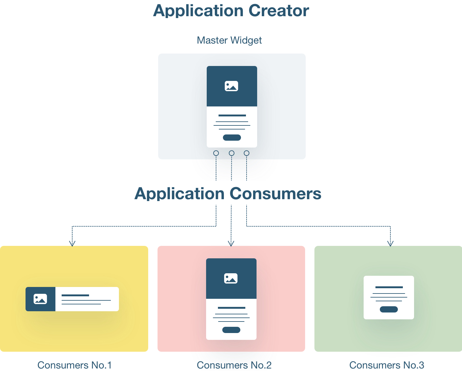
The core tension was structural: users needed full freedom to customise their application, but the application builder also needed to push updates to live sites without overwriting those customisations. Solving one side of that equation easily breaks the other.
In order to keep us on track through the process we defined 3 principle guidelines:
- Content - Users must be able to use their own business content.
- Style - Users should be able to personalize the application design, to match their website brand and desires.
- Supporting updates - We should support the application update cycle without harming users' customization and changes.
The Users
DIY Users with Online Business Presence
Wix seeks to provide a cross over platform editing environment for users with different business goals, using different application services. Their needs range from solving online stores to ordering widgets, from writing a simple blog to running an entire community with friends' visitors.
We wanted our users to grow their business in one place, and for that requires a coherent workspace experience. That would fit 3 different types of users:
- Newbie to website creation - New users, who are also creating their online business for the first time.
- Users who migrate from competing platforms - They already have an online presence on the web, and this is their first attempt with Wix.
- Existing Wix users - People who already have a website on Wix and they decided they need also a business presence, like selling online or offering any online services. Usually they would need at least one application installed on their website.
My Role
I co-led the UX design alongside another designer, working closely with a product manager, a UX content writer, and a team of 5 developers. I owned the research phase — interviewing both application builders (internal Wix teams building booking, members, and store products) and consumers (small business owners using those apps). I was responsible for the information architecture, the dual-mode editing model, wireframe flows covering all scenarios, and the final UI and interaction design. I also ran two rounds of usability testing, analysed the findings, and drove the design iterations that came from them.
Interviewing
What does it Mean to Develop an App?
Part of our user research was learning what kind of customization application builders want to give to their consumers. In order to answer this question, we started with interviewing external "Alpha" customers and internal users like PM, UX, and support agents from Wix, employees working on developing different service products like booking, members, online store, etc.
Those interviews helped us learn how Wix users use different service applications and customize them.
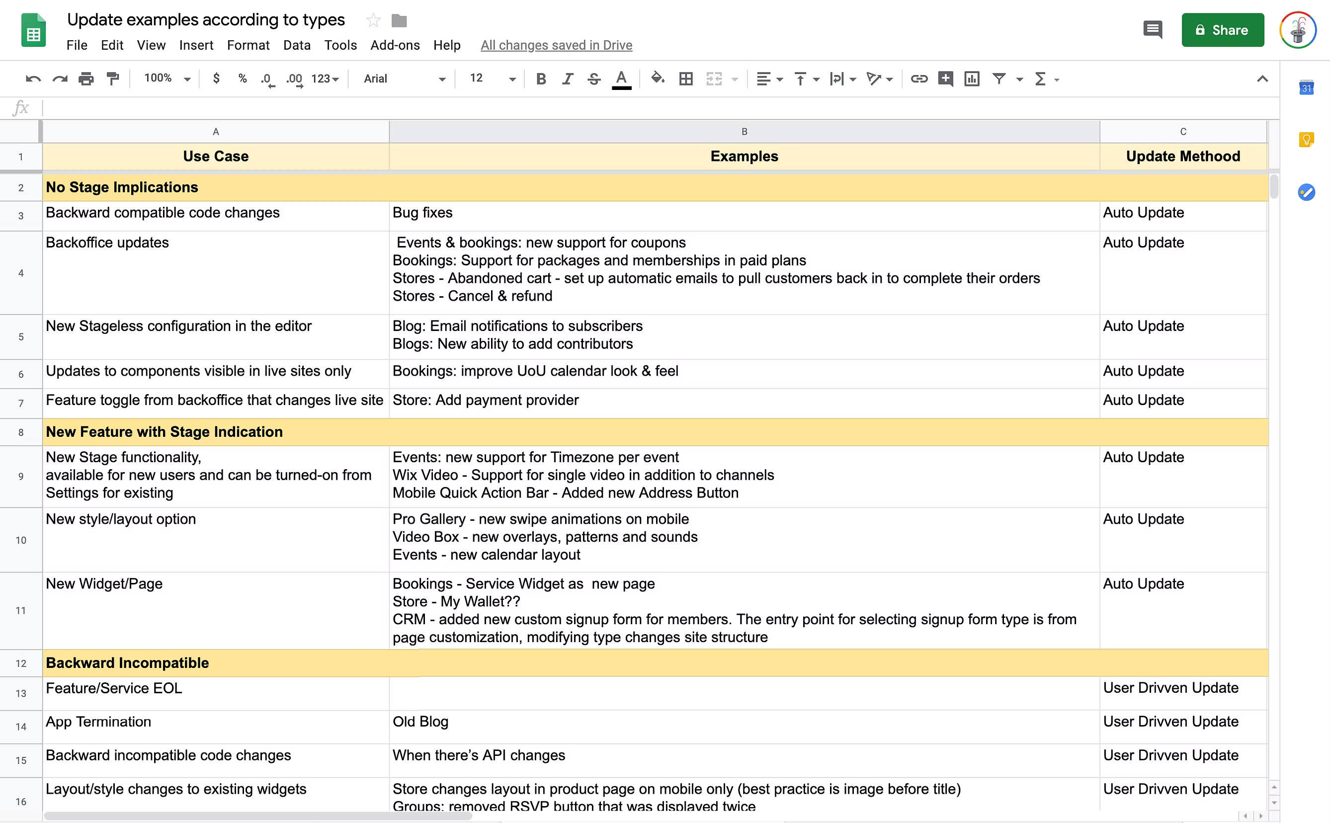
From those interviews we learned 2 important things:
- Update cycles - The complexity of keeping full customization freedom for users while allowing the application builder to push changes and update installed applications that is already live on users' websites.
- Style customization - Between 80-90% of the users need basic customization, choosing between common presets or layouts, and general style changes.
Flow Chart & Analysis
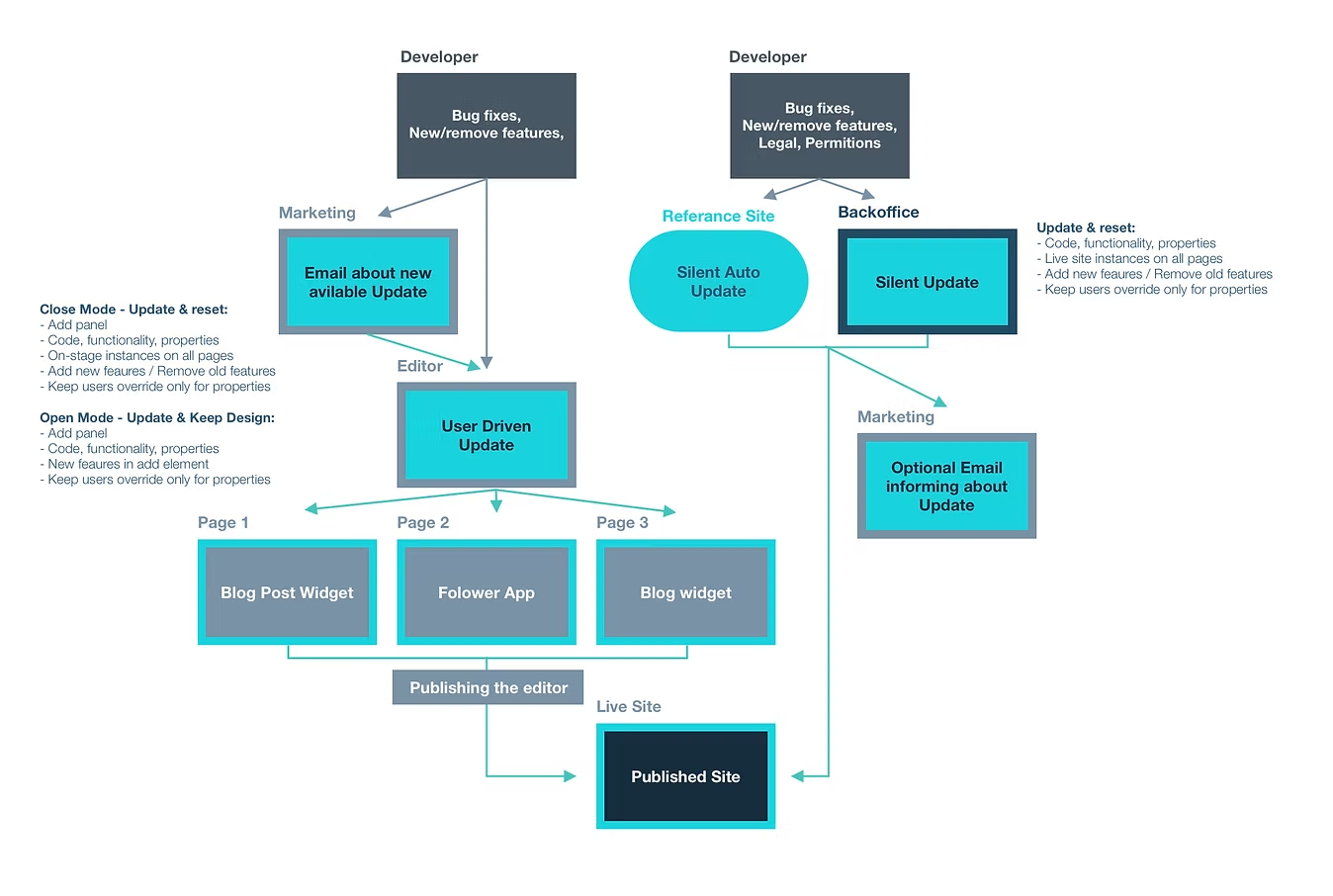
2 Editing Modes
"Closed mode" for simple users:
Interviews confirmed that 80-90% of users need only basic editing - choosing a preset, adjusting colours, or swapping content. This shaped a "Closed" editing mode: guided, constrained, and safe from update conflicts.
"Open mode" for advanced users:
Over time, even simple users grow into their websites. They eventually need layout control, custom elements, or behaviours the closed mode can't support. These are Wix's most loyal users - we couldn't ignore that need.
In order to understand how I should even begin to plan 2 editing modes, I started drawing several flow charts of different business applications. The flowcharts covered 2 parts of the application funnel:
- Developing an application.
- Consuming an application and customizing it.
Defining & Brainstorming
Identify Main Shared and Common Use Cases
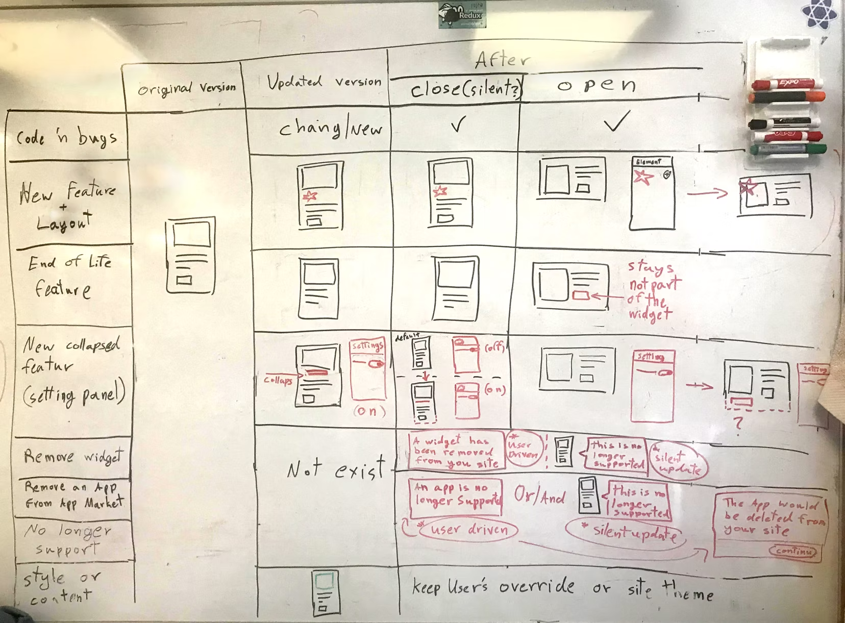
So now we came to the point when we started to imagine and draw the actual experience. But before beginning working on the wireframe, I've summarised on a white board (next to my table, helping me keep in mind) all general use cases and possible touchpoints that users might need or want to customize in a widget:
- What would happen in "Close editing" mode and "Open editing" mode?
- How each editing mode would be affected by the update cycle?
Wireframes
What are the User's Editing Touch Points?
Now came the time for drawing all of our ideas and insights. Creating wireframes is an excellent way to cover all scenarios and use cases. It describes a user installing an app and customizing while editing a locked widget and when the widget is in the more advanced "Open" editing experience mode.
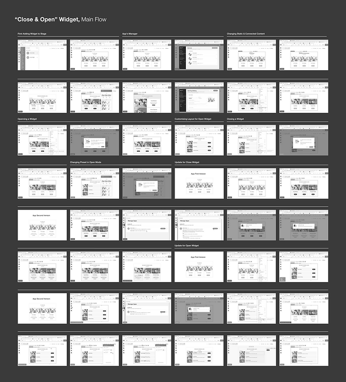
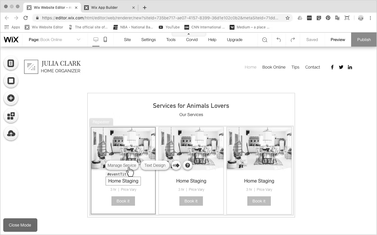
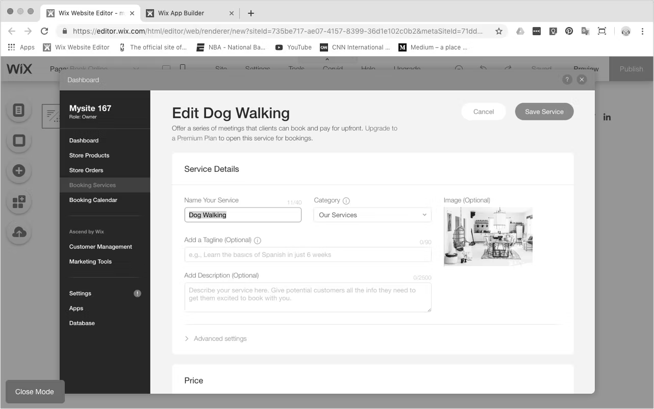
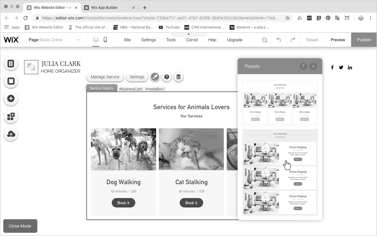
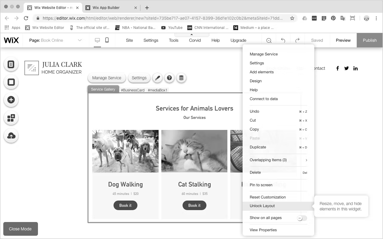
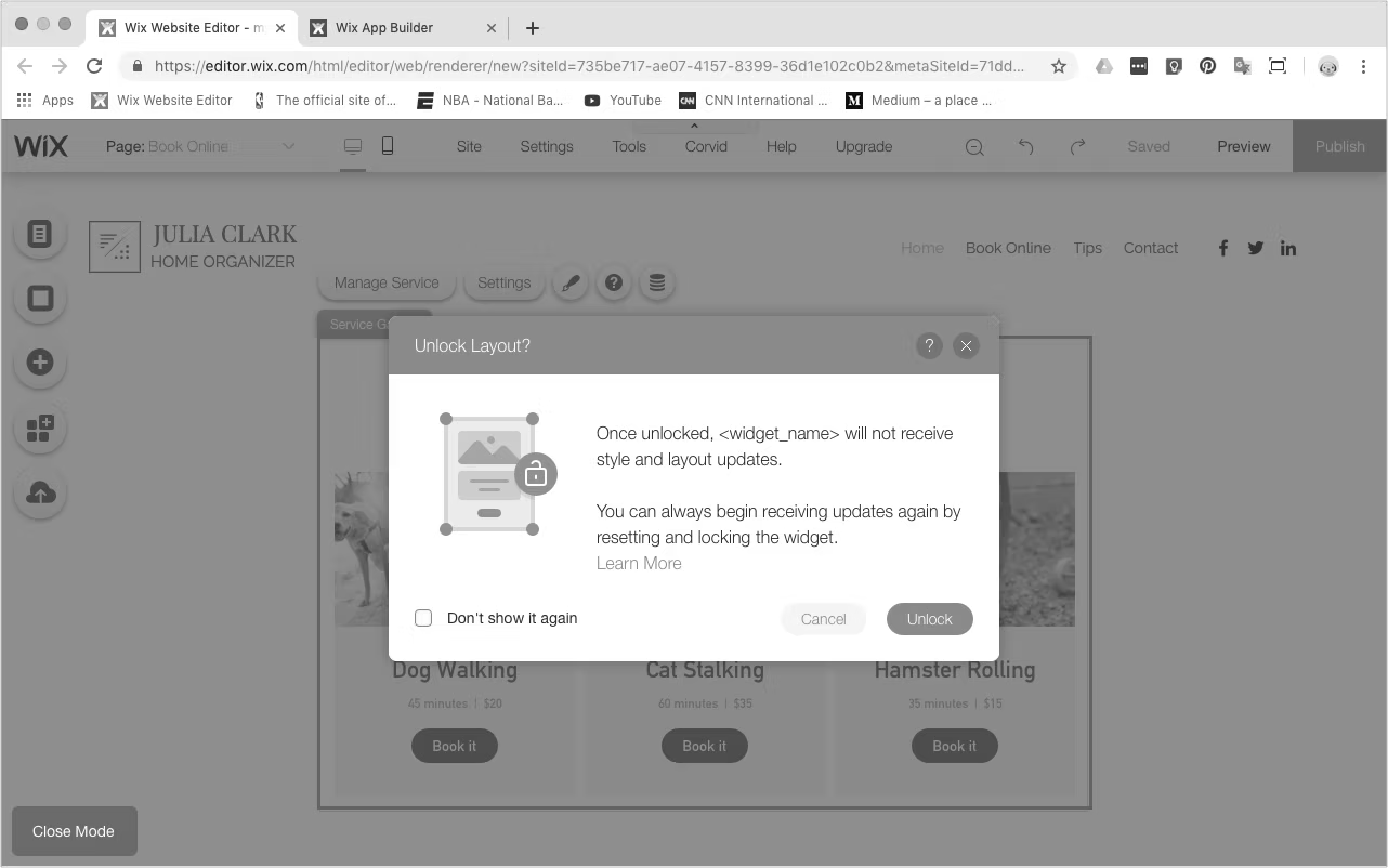
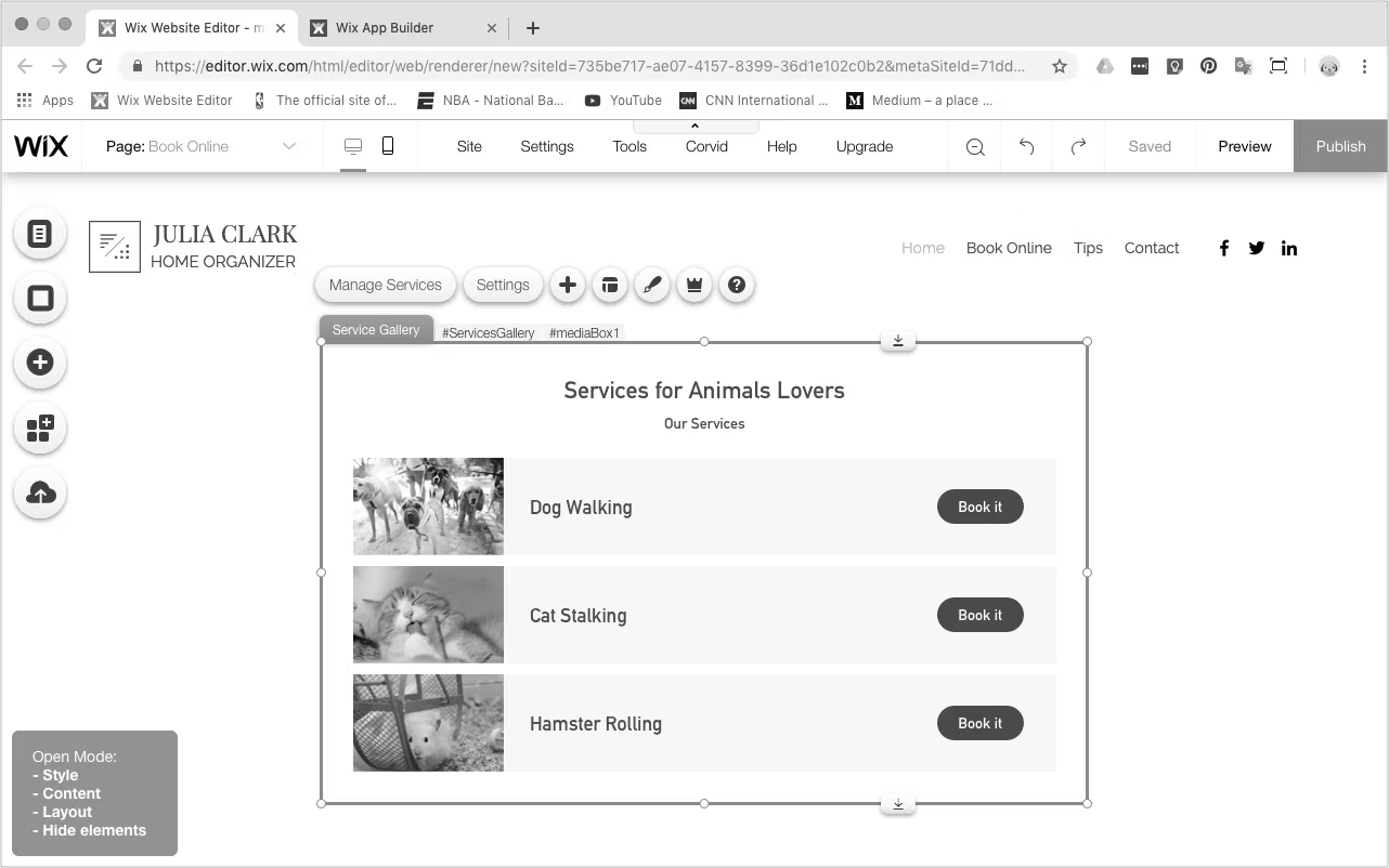
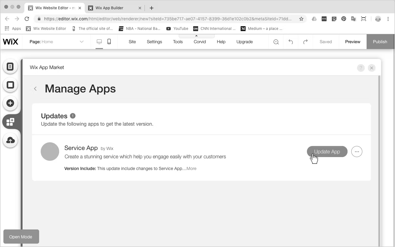
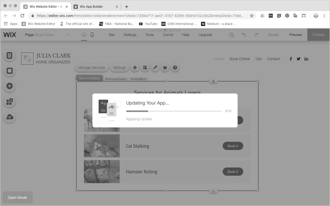
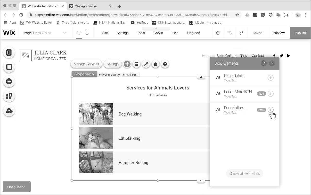
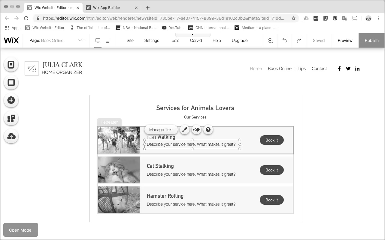
Example screens from the new editing experience
Features
The Editing System
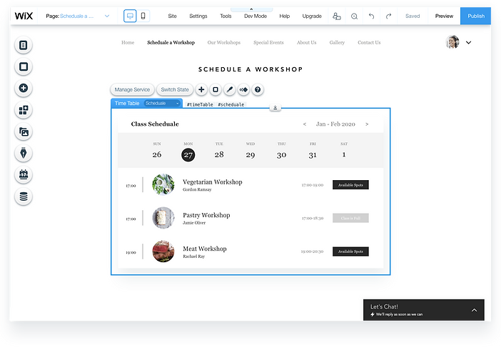
Direct Selection & Editing
Users can select and edit directly each part of the the application widget.
This has two primary and significant advantages:
- Application builder gets all Editor's capabilities for "Free".
- Site owner is free to customize any widget to the desired design.
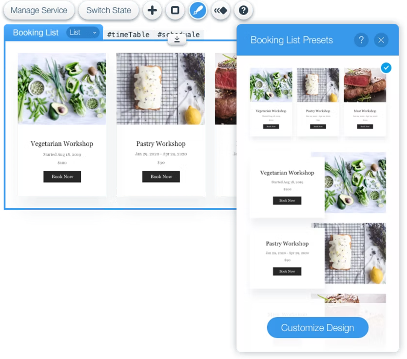
Support Widgets Presets
Users can start customizing their application by choosing a preset from a visual panel, making it very clear to understand the different options of layout, design, or even different features.
Comfortable CMS Content Manager
Users have direct access point to change content in the Content Manager, instantly from the selected widget inside the editor.
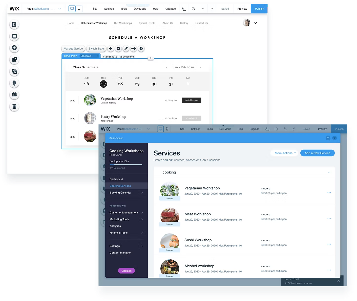
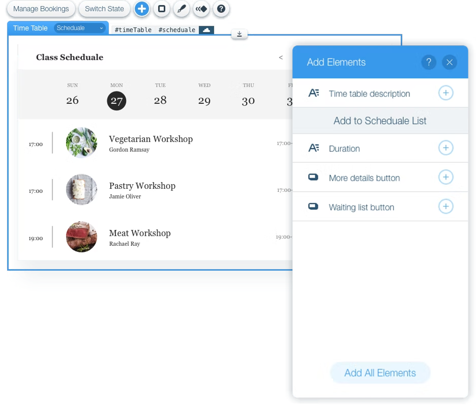
Adding & Deleting Application Elements
Users can create a customized widget by deleting and adding application elements according to their needs.
The Add Element panel also allow the application builder to update and add new features without any conflict with the user customization.
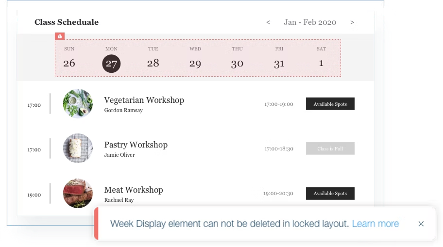
Editing Restrictions for Application
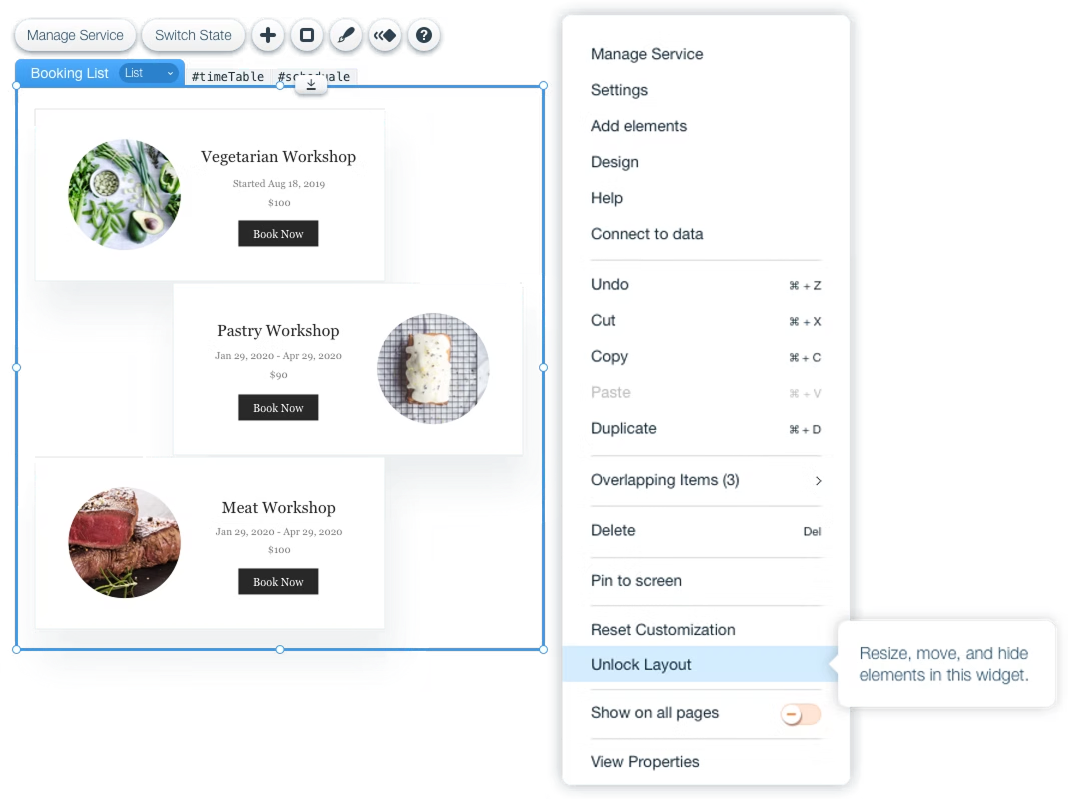
Some of the editing required exceptional behaviors. For example, we created different on-stage indications, alerts, and notifications to let user know, that certain actions are "Not allowed", the layout is locked, and the element has limited customization.
Application Update
For simple users, we designed the new "close" experience in a way that would keep user's customization of design, content, and functionality on his website.
Full Open Editing Layout Mode
Advanced users can decide to open any widget of the application, and have full layout customisation: adding additional elements or changing local widget functionality.
Usability
Testing the Things We Missed
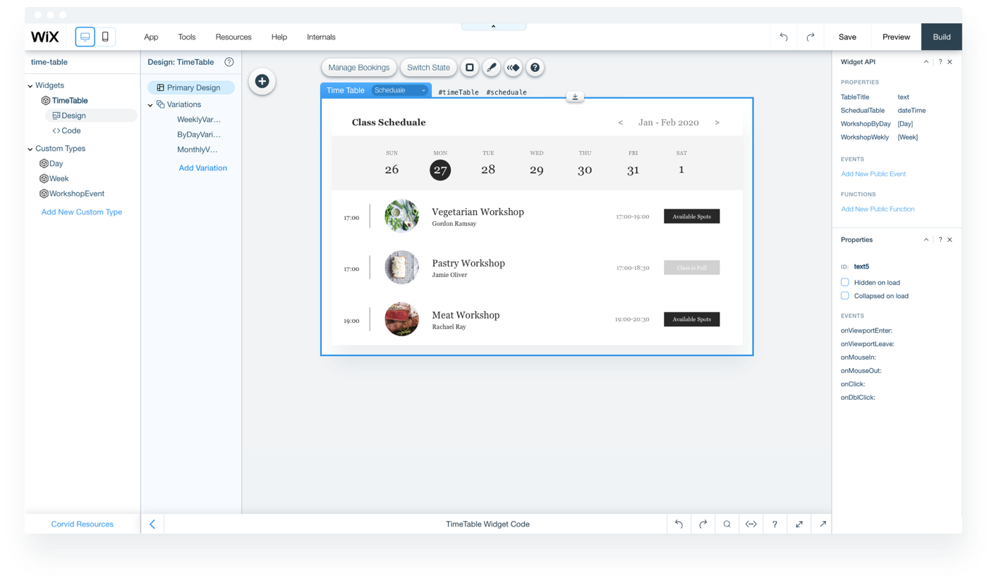
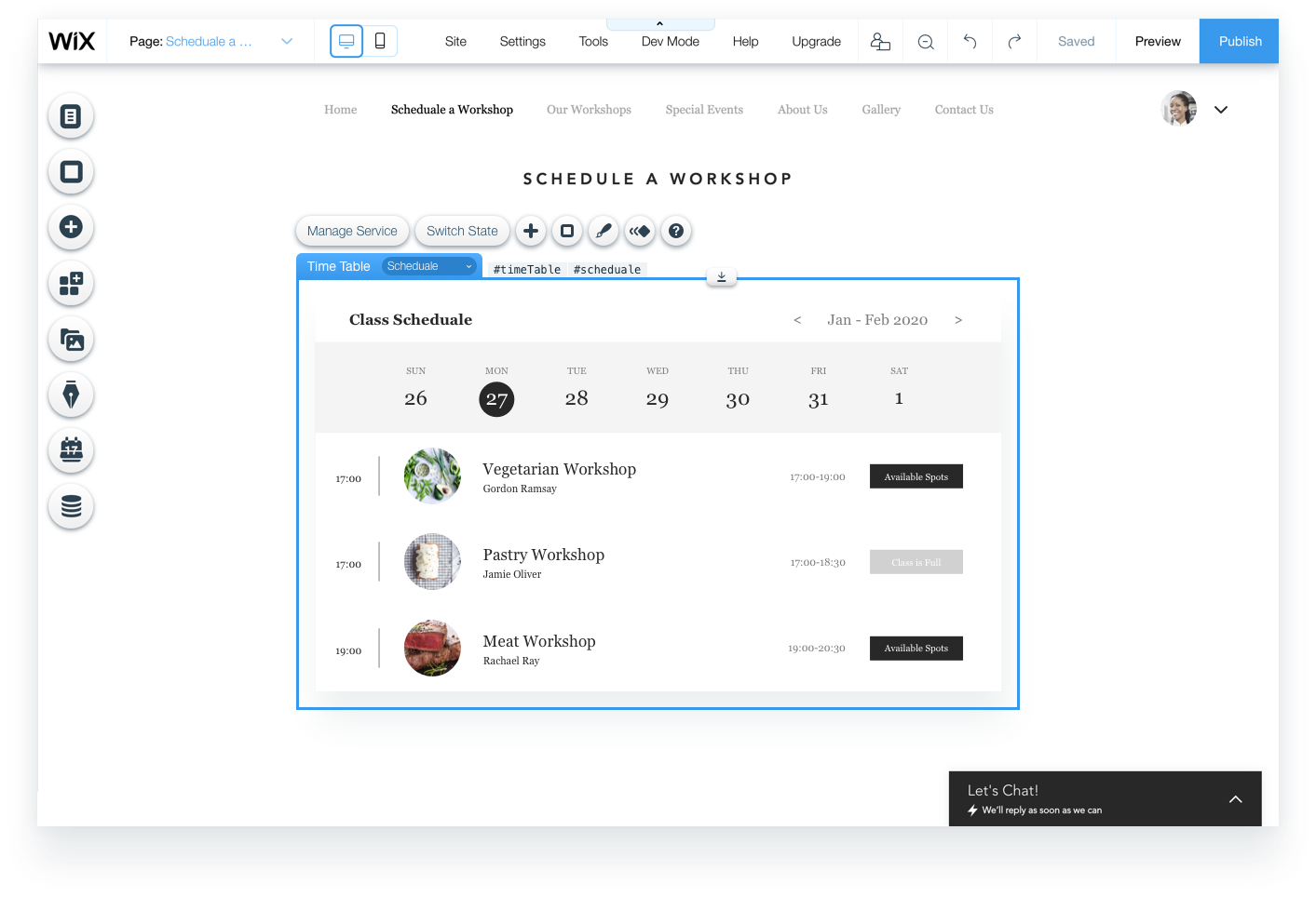
When the new experience was ready and stable enough, we performed several testing sessions on a booking widget called "Time Table". It was one of the first applications built with Wix Blocks by Wix's booking service.
We conducted two usability sessions. The first one testing professional designers and targeting users who were more design orientated, who are used to professional editing experience. The second session was focusing on users that have a small business, and for whom Time Table application could be useful on their website.
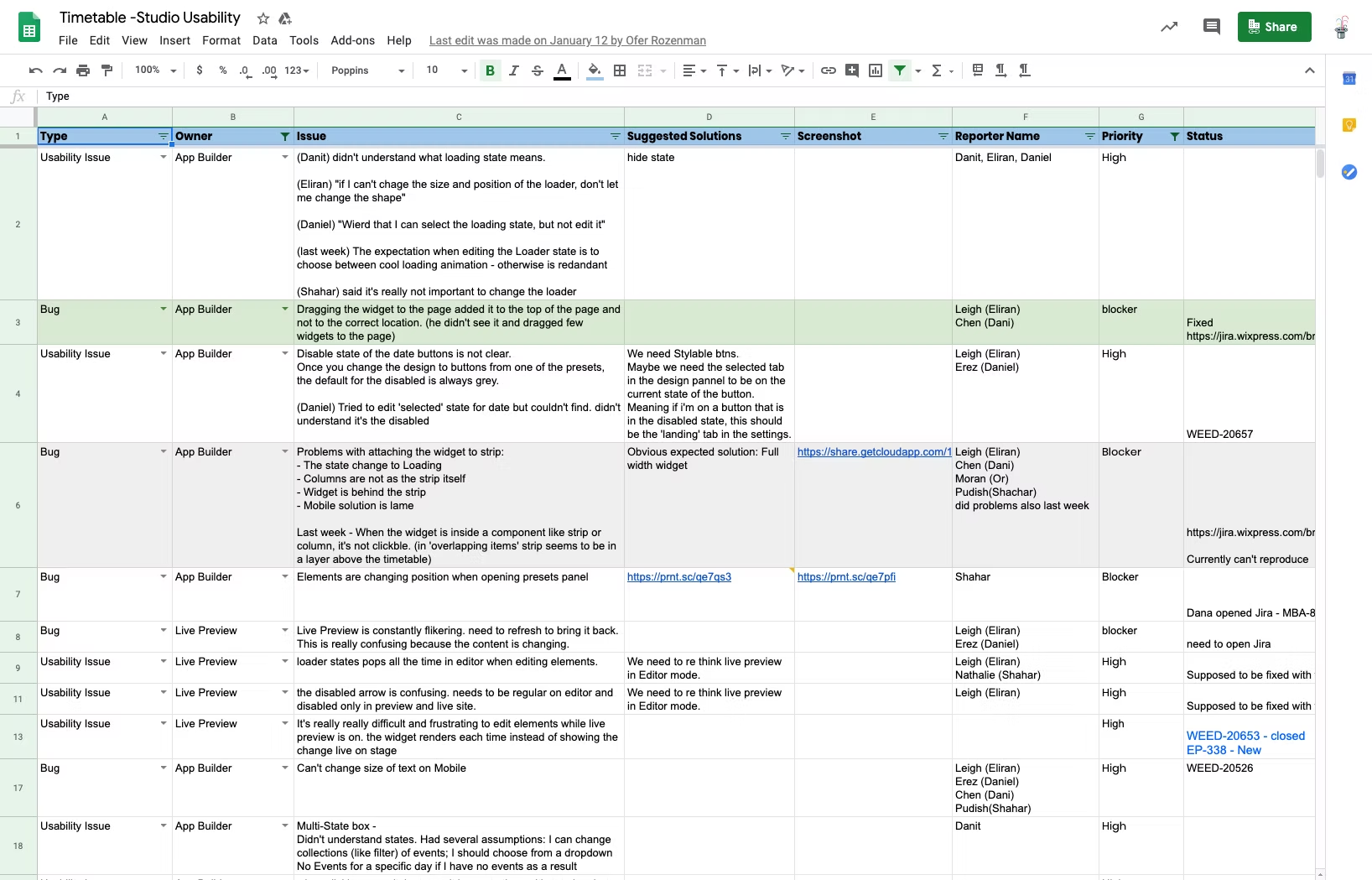
Findings: People got confused trying to change content
The main recurring problem was connected to content editing, we figured out there was a confusion, and it was for two reasons:
- Local widget content vs. application content.
- Editing content vs. customizing font style.
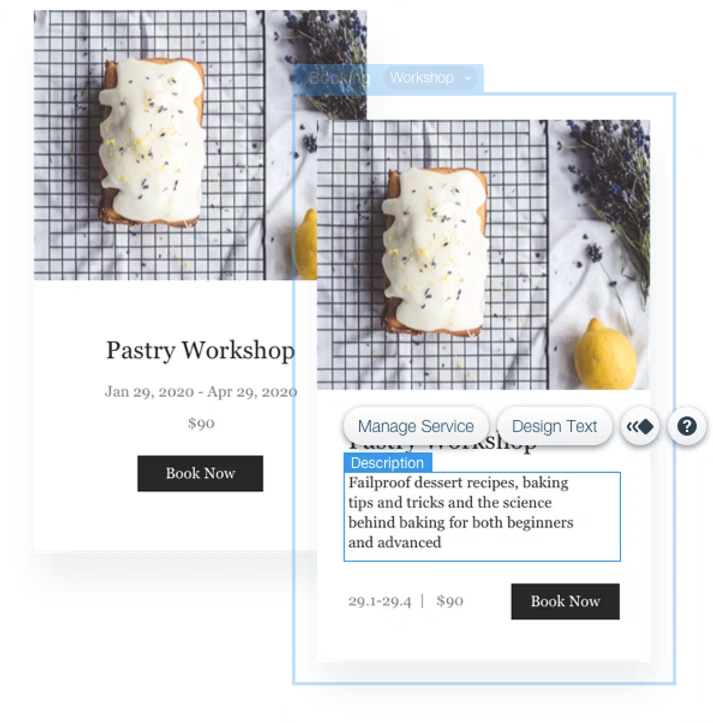
For local instance content, we were planing to use the default and general content editing behaviour. That means, "Edit Text" button is being used for editing content and to open Text Design panel for font styling.
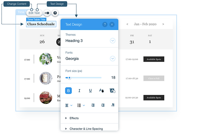
The Fix: Separate action items
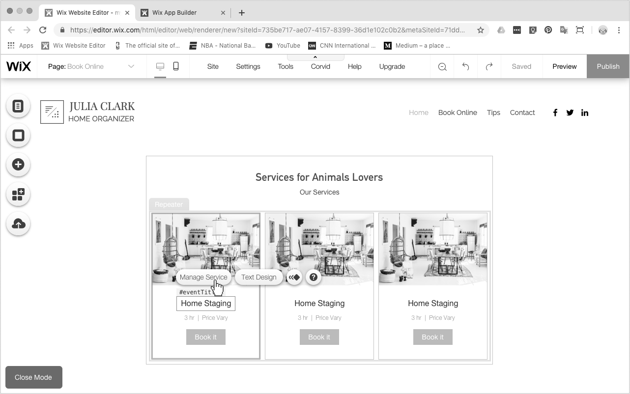
To avoid confusion and make the experience more straightforward, we decided to add another button, an access point for the settings panel, that controls all local widget content and settings.
Results
Separating the two actions gave users a clear mental model: one button for content, one for style. Testers in follow-up sessions were significantly more confident navigating the interface and completed content editing tasks without prompting.
Reflection
What I Would Do Differently
The dual-mode model (Closed vs. Open) was the right strategic call, and the research-backed decision to serve 80% of users with a constrained experience saved significant design and engineering scope. But the content editing gap we discovered in usability testing was a meaningful miss - we were so focused on the customisation architecture that we didn't give enough attention to the most fundamental action users take: editing text.
The deeper lesson: platform-level design problems require holding two user perspectives simultaneously - the builder who creates the app, and the consumer who uses it. When one perspective dominates your thinking, the other suffers. I would now build explicit checkpoints into the process to stress-test both views before committing to a solution.
I'd also push for usability testing earlier - ideally at wireframe stage rather than after a stable build. The content confusion we found wasn't subtle; it would have surfaced in a lo-fi prototype test and saved a full iteration cycle.
מטרת הפרויקט
חוויית עריכה אחידה לאפליקציות של Wix
Wix פיתחה פלטפורמה לבניית אפליקציות ווב בכל העורכים שלה, על בסיס הרכיבים והתשתית של Wix. האתגר העיצובי: ליצור חוויית עריכה שמאפשרת לכל משתמש Wix להתאים אישית אפליקציה, בלי קשר לרמה הטכנית שלו, ובלי לפגוע ביכולת של בונה האפליקציה לשחרר עדכונים.
תוצאות עיקריות
מה הפרויקט השיג
Scope שנגזר מהמחקר
ממצא ה-80-90% מראיונות המשתמשים הגדיר ישירות לאיזה מצב לתת עדיפות. במקום לעצב למקרה הקצה, בנינו את Closed mode כדי לשרת את הרוב, ושמרנו את Open mode למשתמשים הנאמנים והמתקדמים שגדלים אליו.
עיצוב לשני קהלים
הפרויקט דרש לאזן בין שני סוגים של "משתמשים" בו-זמנית: בונה האפליקציה שיוצר את ה-widget, ובעל האתר שמתאים אותו אישית. כל החלטת עיצוב הייתה צריכה לעבוד לשניהם בלי לשבור אף אחד מהם.
התאמה אישית שעמידה לעדכונים
פתרנו אילוץ ברמת הפלטפורמה שרוב פרויקטי ה-UX לא פוגשים: לאפשר למשתמשים להתאים אפליקציה בחופשיות, ובמקביל לאפשר לבונה לשחרר עדכונים חיים בלי לדרוס את ההתאמות האלה.
איטרציה שנולדה מבדיקות שמישות
שני סבבי בדיקות עם משתמשים אמיתיים תפסו בלבול קריטי בעריכת תוכן, ש-review עיצובי בלבד היה מפספס. התיקון, הפרדה בין פעולות תוכן לפעולות סגנון, שיפר באופן מדיד את הביטחון של המשתמשים בסשנים שבאו אחריו.
האתגרים
חופש התאמה אישית בלי לשבור עדכונים
המתח המרכזי היה מבני: משתמשים היו צריכים חופש מלא להתאים את האפליקציה שלהם, אבל גם בונה האפליקציה היה צריך לשחרר עדכונים לאתרים חיים בלי לדרוס את ההתאמות האלה. קל לפתור צד אחד של המשוואה ולשבור את השני.
כדי לשמור על כיוון לאורך התהליך, הגדרנו 3 עקרונות מנחים:
- תוכן - משתמשים חייבים להיות מסוגלים להשתמש בתוכן העסקי שלהם.
- סגנון - משתמשים צריכים להיות מסוגלים להתאים את עיצוב האפליקציה למותג של האתר שלהם ולטעם שלהם.
- תמיכה בעדכונים - צריך לתמוך במחזור העדכונים של האפליקציה בלי לפגוע בהתאמות ובשינויים של המשתמשים.
המשתמשים
משתמשי DIY עם נוכחות עסקית אונליין
Wix רוצה לתת סביבת עריכה אחת, חוצת פלטפורמות, למשתמשים עם מטרות עסקיות שונות, שמשתמשים בשירותי אפליקציות שונים. הצרכים שלהם נעים מחנויות אונליין ועד widgets להזמנות, מכתיבת בלוג פשוט ועד ניהול קהילה שלמה של חברים ומבקרים.
רצינו שהמשתמשים שלנו יגדילו את העסק שלהם במקום אחד, וזה דורש חוויית סביבת עבודה עקבית, שמתאימה ל-3 סוגי משתמשים:
- חדשים ביצירת אתרים - משתמשים חדשים, שגם מקימים את העסק האונליין שלהם בפעם הראשונה.
- משתמשים שעוברים מפלטפורמות מתחרות - כבר יש להם נוכחות ברשת, וזה הניסיון הראשון שלהם עם Wix.
- משתמשי Wix קיימים - אנשים שכבר יש להם אתר ב-Wix והחליטו שהם צריכים גם נוכחות עסקית, כמו מכירה אונליין או הצעת שירותים אונליין. בדרך כלל הם צריכים לפחות אפליקציה אחת מותקנת באתר.
התפקיד שלי
הובלתי את עיצוב ה-UX יחד עם מעצב נוסף, בעבודה צמודה עם product manager, UX content writer וצוות של 5 מפתחים. הייתי אחראי על שלב המחקר: ראיינתי גם בוני אפליקציות (צוותים פנימיים ב-Wix שבנו את מוצרי ה-booking, ה-members וה-store) וגם צרכנים (בעלי עסקים קטנים שמשתמשים באפליקציות האלה). הייתי אחראי על ארכיטקטורת המידע, על מודל העריכה בשני המצבים, על flows של wireframes שמכסים את כל התרחישים, ועל עיצוב ה-UI והאינטראקציה הסופי. הרצתי גם שני סבבים של בדיקות שמישות, ניתחתי את הממצאים, והובלתי את האיטרציות העיצוביות שנבעו מהם.
ראיונות
מה זה אומר לפתח אפליקציה?
חלק ממחקר המשתמשים היה ללמוד איזו התאמה אישית בוני אפליקציות רוצים לתת לצרכנים שלהם. כדי לענות על השאלה הזאת, התחלנו בראיונות עם לקוחות "Alpha" חיצוניים ועם משתמשים פנימיים, כמו אנשי PM, UX ותמיכה ב-Wix, שעובדים על פיתוח מוצרי שירות שונים כמו booking, members, חנות אונליין ועוד.
הראיונות עזרו לנו ללמוד איך משתמשי Wix משתמשים באפליקציות שירות שונות ומתאימים אותן.
מהראיונות למדנו 2 דברים חשובים:
- מחזורי עדכון - המורכבות של שמירה על חופש התאמה מלא למשתמשים, ובמקביל לאפשר לבונה האפליקציה לדחוף שינויים ולעדכן אפליקציות מותקנות שכבר חיות באתרי המשתמשים.
- התאמת סגנון - בין 80% ל-90% מהמשתמשים צריכים התאמה בסיסית: בחירה בין presets או layouts נפוצים, ושינויי סגנון כלליים.
תרשימי זרימה וניתוח
2 מצבי עריכה
"Closed mode" למשתמשים פשוטים:
הראיונות אישרו ש-80-90% מהמשתמשים צריכים רק עריכה בסיסית: בחירת preset, התאמת צבעים או החלפת תוכן. מזה נולד מצב עריכה "סגור": מודרך, מוגבל ובטוח מהתנגשויות עם עדכונים.
"Open mode" למשתמשים מתקדמים:
עם הזמן, גם משתמשים פשוטים גדלים עם האתר שלהם. בסוף הם צריכים שליטה ב-layout, אלמנטים מותאמים אישית או התנהגויות שהמצב הסגור לא תומך בהן. אלה המשתמשים הנאמנים ביותר של Wix, ולא יכולנו להתעלם מהצורך הזה.
כדי להבין איך בכלל מתחילים לתכנן 2 מצבי עריכה, התחלתי לשרטט כמה תרשימי זרימה של אפליקציות עסקיות שונות. התרשימים כיסו 2 חלקים במשפך של האפליקציה:
- פיתוח אפליקציה.
- צריכת אפליקציה והתאמה אישית שלה.
הגדרה וסיעור מוחות
זיהוי מקרי השימוש המשותפים והנפוצים
הגענו לנקודה שבה התחלנו לדמיין ולשרטט את החוויה עצמה. אבל לפני שהתחלתי לעבוד על ה-wireframes, סיכמתי על לוח מחיק (ליד השולחן שלי, כדי שיישאר לי מול העיניים) את כל מקרי השימוש הכלליים ונקודות המגע שמשתמשים עשויים להצטרך או לרצות להתאים ב-widget:
- מה קורה במצב "Closed editing" ובמצב "Open editing"?
- איך כל מצב עריכה מושפע ממחזור העדכונים?
Wireframes
מהן נקודות המגע של המשתמש בעריכה?
הגיע הזמן לשרטט את כל הרעיונות והתובנות שלנו. Wireframes הם דרך מצוינת לכסות את כל התרחישים ומקרי השימוש. הם מתארים משתמש שמתקין אפליקציה ומתאים אותה אישית, גם כשהוא עורך widget נעול וגם כשה-widget נמצא במצב העריכה המתקדם יותר, "Open".
מסכים לדוגמה מחוויית העריכה החדשה
פיצ'רים
מערכת העריכה
בחירה ועריכה ישירה
משתמשים יכולים לבחור ולערוך ישירות כל חלק ב-widget של האפליקציה.
לזה יש שני יתרונות מרכזיים ומשמעותיים:
- בונה האפליקציה מקבל את כל היכולות של העורך "בחינם".
- בעל האתר חופשי להתאים כל widget לעיצוב שהוא רוצה.
תמיכה ב-presets של widgets
משתמשים יכולים להתחיל להתאים את האפליקציה בבחירת preset מתוך פאנל ויזואלי, שמבהיר היטב את האפשרויות השונות של layout, עיצוב ואפילו פיצ'רים.
גישה נוחה ל-CMS Content Manager
למשתמשים יש נקודת גישה ישירה לשינוי תוכן ב-Content Manager, מיד מתוך ה-widget שנבחר בעורך.
הוספה ומחיקה של אלמנטים באפליקציה
משתמשים יכולים ליצור widget מותאם אישית על ידי מחיקה והוספה של אלמנטים של האפליקציה, לפי הצרכים שלהם.
פאנל Add Element מאפשר גם לבונה האפליקציה לעדכן ולהוסיף פיצ'רים חדשים, בלי שום התנגשות עם ההתאמות של המשתמש.
מגבלות עריכה לאפליקציה
חלק מהעריכה דרש התנהגויות חריגות. למשל, יצרנו חיוויים על ה-stage, התראות והודעות, כדי שהמשתמש ידע שפעולות מסוימות "אינן מותרות", שה-layout נעול, ושלאלמנט יש אפשרויות התאמה מוגבלות.
עדכון אפליקציה
למשתמשים פשוטים, עיצבנו את החוויה ה"סגורה" החדשה כך שתשמור על ההתאמות של המשתמש באתר שלו: עיצוב, תוכן ופונקציונליות.
מצב עריכת layout פתוח מלא
משתמשים מתקדמים יכולים להחליט לפתוח כל widget של האפליקציה ולקבל התאמה מלאה של ה-layout: הוספת אלמנטים נוספים או שינוי פונקציונליות מקומית של ה-widget.
שמישות
בודקים את מה שפספסנו
כשהחוויה החדשה הייתה מוכנה ויציבה מספיק, ערכנו כמה סשנים של בדיקות על widget של booking בשם "Time Table". זו הייתה אחת האפליקציות הראשונות שנבנו עם Wix Blocks, על ידי שירות ה-booking של Wix.
ערכנו שני סשנים של בדיקות שמישות. הראשון עם מעצבים מקצועיים ומשתמשים בעלי אוריינטציה עיצובית, שרגילים לחוויית עריכה מקצועית. השני התמקד במשתמשים עם עסק קטן, שאפליקציית Time Table יכולה להיות שימושית באתר שלהם.
ממצאים: אנשים התבלבלו כשניסו לשנות תוכן
הבעיה העיקרית שחזרה הייתה קשורה לעריכת תוכן. הבנו שיש בלבול, משתי סיבות:
- תוכן מקומי של ה-widget מול תוכן של האפליקציה.
- עריכת תוכן מול התאמת סגנון הפונט.
לתוכן של מופע מקומי תכננו להשתמש בהתנהגות עריכת התוכן הכללית, ברירת המחדל. כלומר, כפתור "Edit Text" משמש גם לעריכת תוכן וגם לפתיחת פאנל Text Design לעיצוב הפונט.
התיקון: פעולות נפרדות
כדי למנוע בלבול ולהפוך את החוויה לפשוטה יותר, החלטנו להוסיף כפתור נוסף: נקודת גישה לפאנל ההגדרות, ששולט בכל התוכן וההגדרות המקומיים של ה-widget.
תוצאות
הפרדת שתי הפעולות נתנה למשתמשים מודל מנטלי ברור: כפתור אחד לתוכן, כפתור אחד לסגנון. נבדקים בסשנים שבאו אחר כך ניווטו בממשק בביטחון רב יותר, והשלימו משימות של עריכת תוכן בלי הכוונה.
מבט לאחור
מה הייתי עושה אחרת
מודל שני המצבים (Closed מול Open) היה ההחלטה האסטרטגית הנכונה, וההחלטה מבוססת המחקר לשרת 80% מהמשתמשים בחוויה מוגבלת חסכה scope משמעותי בעיצוב ובפיתוח. אבל הפער בעריכת התוכן שגילינו בבדיקות השמישות היה פספוס משמעותי: היינו כל כך ממוקדים בארכיטקטורת ההתאמה האישית, שלא נתנו מספיק תשומת לב לפעולה הבסיסית ביותר שמשתמשים עושים: עריכת טקסט.
הלקח העמוק יותר: בעיות עיצוב ברמת הפלטפורמה דורשות להחזיק שתי נקודות מבט של משתמשים בו-זמנית: הבונה שיוצר את האפליקציה, והצרכן שמשתמש בה. כשנקודת מבט אחת שולטת בחשיבה, השנייה נפגעת. היום הייתי בונה לתוך התהליך נקודות בדיקה מפורשות, כדי לבחון את שתי נקודות המבט לפני שמתחייבים לפתרון.
הייתי גם דוחף לבדיקות שמישות מוקדם יותר, רצוי בשלב ה-wireframes ולא אחרי build יציב. הבלבול בתוכן לא היה עדין; הוא היה צף כבר בבדיקה של אב-טיפוס lo-fi וחוסך מחזור איטרציה שלם.