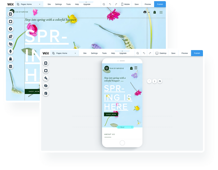
Mobile Editor Intro
Mobile Onboarding Wizard
The Challenge
Increase Awareness for Mobile Editor
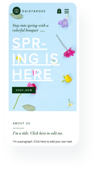
Wix automatically creates a mobile-friendly version of the site. Alongside the auto algorithm, Wix has a Mobile Editor for more personalization.
Numbers showed that less than 20% of the users have been visiting the Mobile Editor. It was important to us to encourage & teach Wix users they have a mobile version of their website, and also the benefits of using it.
Using a human-centered design approach, we focused on the most critical features of the mobile version, hoping to simplify the encounter with a mobile editor for the first time, which would reduce risk of frustration or confusion.
My Role
On this project I was leading the UX of the mobile editor group, working with a Product Manager, UX Content Writer and a dedicated talented front end developer.
- Competitors research / Market research
- User Journey mapping
- Creating UX wireframes
- Prototyping
- UI Design spec
- Illustration
- Defining interactions and behaviours spec
Journey Map
The Current Experience
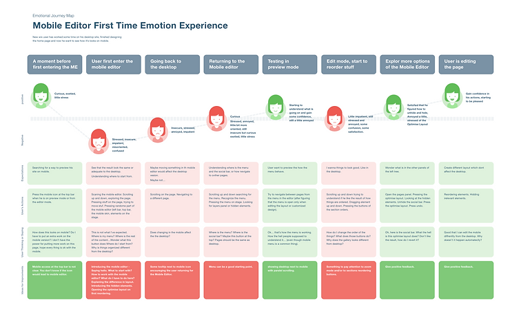
As a UX designer, I wanted to understand first of all what are the feelings, thoughts, and emotions that users experience when first encountering the Mobile Editor.
In order to understand and identify that feeling better, we created a journey map to help us understand the "fragile moment" of the first encounter with the mobile editor.
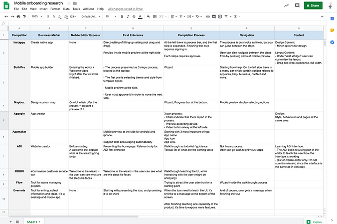
Market Research
Look & Learn from Others
Analysing different onboarding experiences that are familiar to mobile users.
Ideation & Prototyping
The Best Way to Improve Engagement
Wireframing and sketching is something that repeatedly happens throughout the entire process. Working in a team is a process of a lot of good ideas that need to be gathered eventually into a successful product.
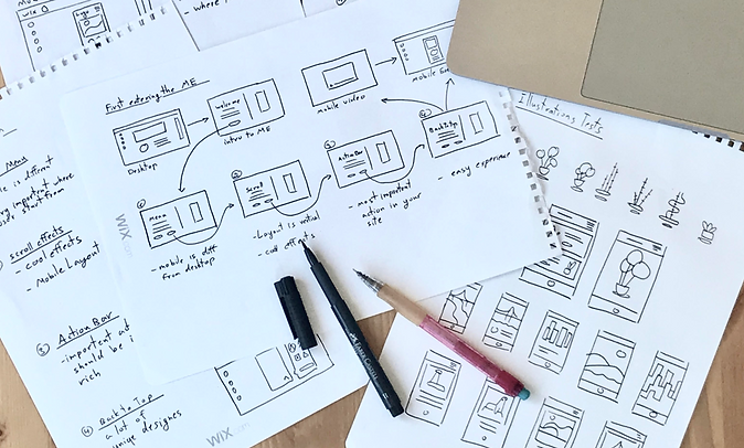
We knew there are some features in the Mobile Editor that are important for any mobile visitor. Also, there are unique features that different users might need according to the business role of their website.
There were several ideas on what is the correct approach and how to achieve our goals. So, to be certain, I created four rough prototypes using Axure so that I could test them with people.
.png)
.png)
.png)
.png)
Several concepts that were prototyped and tested
The Final Product
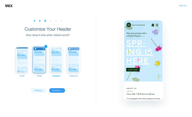
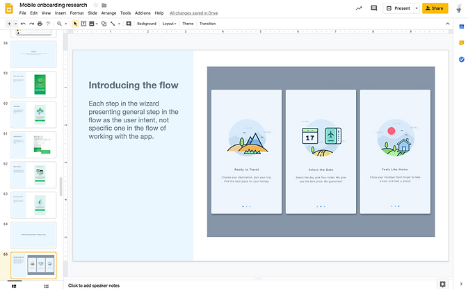
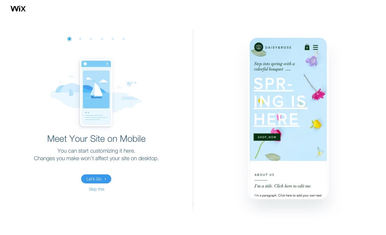
The Onboarding Wizard
When a user starts a new website, we focus him on 3–5 steps, exposing some of the main features that the Mobile Editor can offer , features that have a great impact in a mobile site. According to the user's profile.
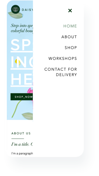
Mobile Menu
One of the most distinguishing features that are different between desktop to mobile is the menu.
Scroll Effects
Another essential understanding that users need to know about experiencing content on mobile is the scrolling. What better way of creating awareness, then let him choose scrolling effects?

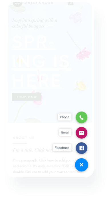
Actions Bar
The Actions Bar is one of the most engaging features on a user's site. We decided to recommend our site owner place on this bar the most important services that they can offer, considering that their site visitors are mobile visitors.
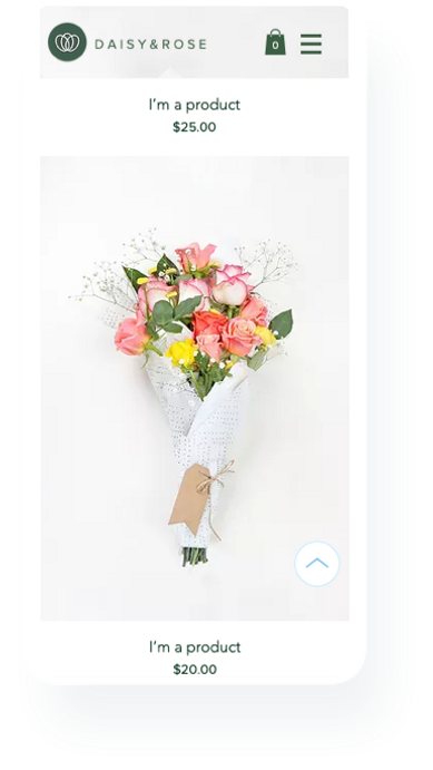
Back to Top
A unique feature that is necessary for the mobile experience is the tiny and noticeable button that allows you to scroll to the top of the site at once. Wix has a lot of cool design options, and what's a better way to show off with them than one cool button?
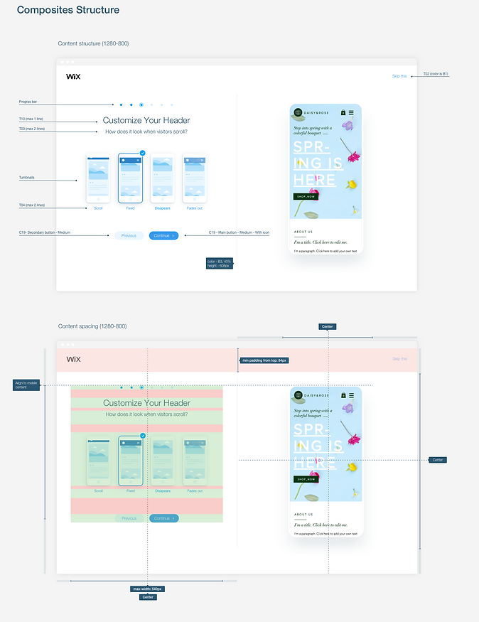
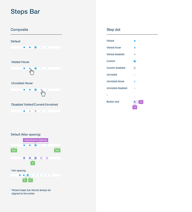
Design
Pixel Perfect Specs
Part of my responsibility as a UI designer is making sure that design, functionality, and the overall experience, survive the execution process. It means creating assets that are as clear as possible and well documented.
What's Next?
Keep Learning
So after three months, we started to get significant numbers. We saw that 47% of users completed the Mobile intro. 60% of the users engaged with different options and kept them on publish. The most successful feature was the Quick Action Bar with an increment of 500% adding to the site!
Another principal value that we have been able to connect , the main pain points of an experienced mobile editor's site, supporting relevant and fun features and experience.
Test out a new wizard interface that can reveal some critical AI-targeted features, and help more accurately and more specifically how users end their site.